Turning a specimen case into something worth collecting.
Meguro Parasitological Museum, the only museum in the world dedicated entirely to parasitology, wanted an interactive layer in front of its display cases to make a visit genuinely enjoyable. The brief pointed at a young audience first, without asking to lose anyone else in the room.
Scope of Work
A specialist collection, asked to be fun for people who aren't specialists yet.
Meguro is a single-subject museum: parasitology, full stop. The brief was to design an interactive experience that sits in front of the existing display cases and makes a visit fun, aimed primarily at a young audience, without asking the museum to simplify what makes the collection worth visiting in the first place.
Build an interactive layer for the museum's own collection that visitors actively enjoy, with young people as the primary audience.
A touchscreen kiosk in front of each vitrine that turns the collection into something people choose to dig through, species by species.
Design something a kid wants to touch and a specialist doesn't dismiss, on the same public device, with no way to ask which one is standing there.
Design Problem
How do you make a visit to a highly specialized museum genuinely fun for a young audience, on a shared public kiosk, without simplifying anything a specialist would notice?
Make it a collection, not a lesson.
No formal research phase ran ahead of this one, the timeline didn't allow for it. The starting point was reasoning from behavior instead of interview data: what keeps people voluntarily engaged with something dense and repetitive, without anyone forcing them to?
Collection mechanics translate across age
Trading cards, model kits, sneakers. Nobody explains the appeal to a kid, and it doesn't read as childish to an adult either. It's the one game structure that could serve both audiences on the same device without a mode switch.
The science stays exactly as written
Every page keeps its full clinical content: taxonomy, life cycle stages, treatment protocols, prevalence figures. Nothing was cut or softened to make room for the game. The game sits on top of the content, never in place of it.
A quiz layer with points and a leaderboard. Solves engagement on paper but turns the museum into a competition, which alienates the adult visitor and rewards speed over reading.
A specimen box that fills up as you read and play. No score, no comparison between visitors, no clock. Completion is private and self-paced.
Not personas. Constraints wearing faces.
No interview round ran ahead of this project. These are working assumptions I designed against, not validated personas, and that distinction matters more than the format.
Comes for the data
Wants taxonomy and treatment tables. Jumps straight to one section, never touches the game.
Needs an answer, fast
Checking symptoms or prevention on behalf of a kid who just touched something they shouldn't have. One glance, not a scroll.
Hunts, reads by accident
Doesn't care about the science yet. Cares about finding the hidden creature and filling the box. Reads the page as a side effect of hunting.
Quiet enough for a gallery, alive enough to feel like a game.
The kiosk sits in a physical room with other visitors standing nearby, so anything loud or arcade-like was off the table before it was ever a design choice. The sound layer had to feel like a game without sounding like one.
Literal, squelchy creature sounds on every interaction. The subject matter makes that the obvious joke, and it's exactly why it would get old by the second specimen and undercut the museum's own credibility.
An organic, tactile texture library that reads as specimen-like without ever tipping into gross, sitting on top of a continuous ambient bed instead of a silent interface with sound effects bolted on.
The through-line is texture over volume. Underwater tones for the ambient bed instead of anything melodic or game-like, organic rather than cartoonish for every touch interaction, and the one exception, the fanfare and paper tear at the very end, earns its size by being the only cue in the whole system that isn't calm.
Read to find it, not find to be tested on it.
A colored specimen sits somewhere unpredictable on every page. It's never behind a quiz answer. It rewards the read instead of testing it, because a wrong-answer gate would punish exactly the visitor this project needed to win over.
Memory game
Match organs beneath the worm. Reinforces morphology without a written quiz.
Fragment rotation
Rotate tiles to restore the specimen, echoing its unusually folded body structure.
Word search
Find terms tied to raw fish culture, the species' actual transmission route.
Maze escape
One exit, no way back, mirroring a life cycle that ends in a biological dead end in humans.
Filling the box unlocks a coupon for the museum's own gift shop. A collection only means something if finishing it produces something, and this is the one place the project asks the museum's business side for something back, in exchange for a visit that ends with a physical takeaway instead of a screen going dark.
Close to the code, because the device demanded it.
Each parasite page ships as its own React and TypeScript build, compiled to a static bundle that runs without a live connection, since the kiosk sits unattended in the gallery for months at a time.
IntersectionObserver
Drives the sidebar's active-section state as someone scrolls, so a long clinical page never feels disorienting on a touchscreen.
Three.js, kept strictly decorative
A thin canvas renders an ambient drift of specimen shapes behind the reading content. It never intercepts a touch or competes with the drag-and-drop collecting.
Honest status, not a highlight reel.
The template has held without structural revision across every species built so far. What hasn't happened yet is real visitor testing. No SUS score, no task success rate, nothing I'd stand behind as validated data. That's next, not solved.
Moderated sessions at the actual kiosks, watching real visitors of different ages use it unprompted. Confirms or breaks the three-visitor assumption.
Does the loop still feel worth finishing past ten species, or does it need a way to resume a partial box across more than one visit.
More species, same template, only if Q1 and Q2 hold up.
Key Learnings
The honest version of a design decision travels further than the impressive-sounding one.
Most of the restraint in this project came from removing things rather than adding them: a quiz layer removed in favor of a collection mechanic that doesn't punish anyone, color removed from everything except the one thing meant to be chased, volume removed from every sound cue until only the shape of a game was left. Each of those cuts came from the same question, does this still work for a specialist standing three feet from a kid who's only here for the hunt.
View live experienceMore projects
Curious about my work?
Let's have a chat!
I spend most of my time where product design meets the work that makes it real: brand systems, interface decisions, and the front-end that ships them.
If you're building something and want a second opinion, looking to collaborate, or just curious where product design is heading, send a message - I read every one.
Pawka
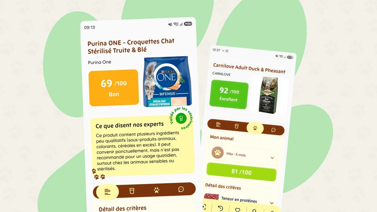
Pet owners wanted clarity. Labels had no language. Pawka had the science but no unified experience - scoring felt opaque, trust felt earned nowhere, and every aisle became a decision paralysis.